Lomotion's second lomography exhibition.
So I was kind of modelling for Cudas for her panel in this exhibition (she couldn't find anyone else), and she decided to go for the siao(crazy) look.
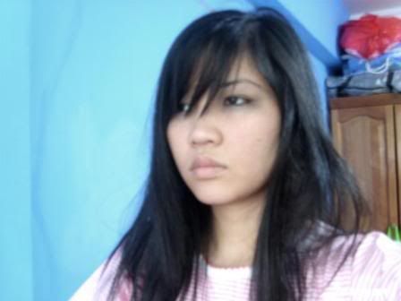
She bought the pink pyjama dress from Bugis and let me play with her expensive expensive eyeshadow (that I bought for her that she never uses).
She had this "crazy person in hospital gown" idea in mind, and since pink (with a teddy bear over the pocket) won't do for a hospital gown, she used her B&W film instead. It turned out awesome.
We started playing with the idea of knives, blood and chalk.
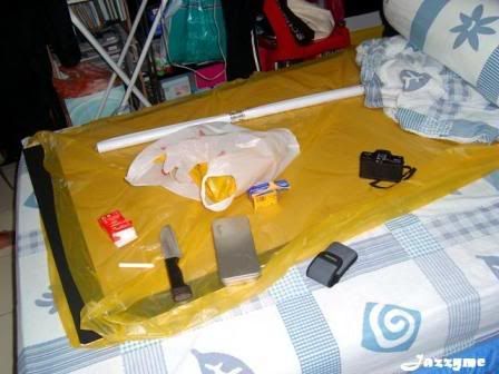
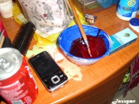
The blood here, is made of Tamiya paint (for those in the know, it's clear red X-27), and you're not going to believe this but, nutella chocolate and peanut butter.
It... was.... disgusting, but looked awfully real.
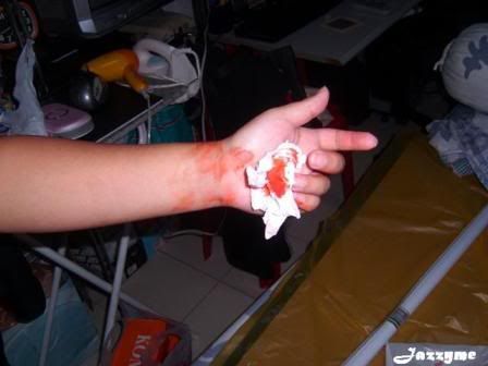
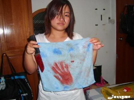
We couldn't stop laughing all throughout the shoot, which wasn't good because it was 6pm and the sky was getting dark, and Cudas didn't want to use flash for her photos.
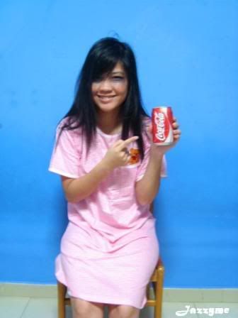
But we wasted a lot of film on laughing shots. And product placement.
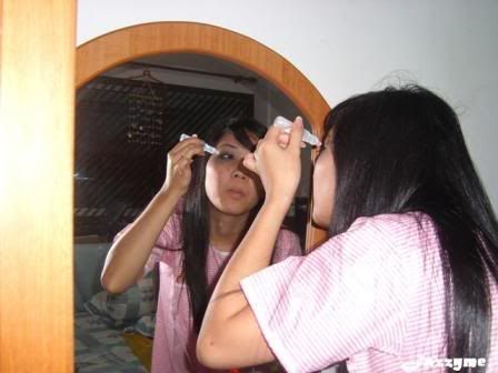
This one's for the eyedrop.
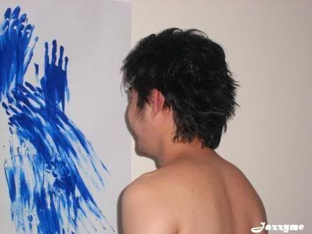
So after my shoot, Lazy got reeled in to do a shoot for Cudas' panel too. Cudas moved the living room furniture and got Lazy to paint with her while I took a shower. The results were stunning when I came out.
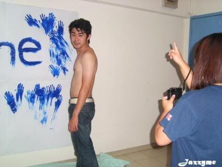
She got Lazy half-naked and got him to mess up his hair with wax (which looked super good). Lazy dislikes this look, but I think it's sexy.
It was a fun few days of shooting, and the end results were good, because according to Cudas, most people liked the crazy-person section of her panel.
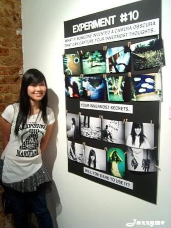
That would be the lower half of the panel. I liked the color photos better, but then that's just me.
Unfortunately these photos belong to Cudas, so I am unable to reproduce them in their majestic entirety. I can, however, give you a close up of the panel.
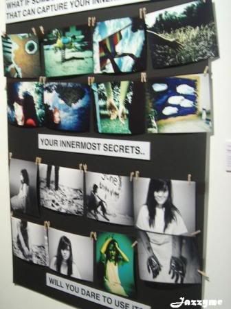
Not as close, lah, but still nice.
The other panels in the exhibitions were awesome too, I especially like Jimmy's one of the wooden box/seats with the backside photos. Very, very creative. Oh, and the walls filled with photos for the theme of playground, playmates, playthings, and the members photo panel.
The place was small, but it was awesome. See what you missed out on, Botak?
No comments:
Post a Comment